Data Maps
About data maps
One of the most common types of maps that scholars want to create are maps of data, more properly called thematic maps. These maps show one or several variables (or themes) arranged spatially on a map. Sometimes the data is arranged on top of a cartographic base layer; other times, as in a cartogram, the spatial arrangement is only approximate.
While such maps are increasingly common today, their lineage goes back to at least the nineteenth century. Consider the two maps below.

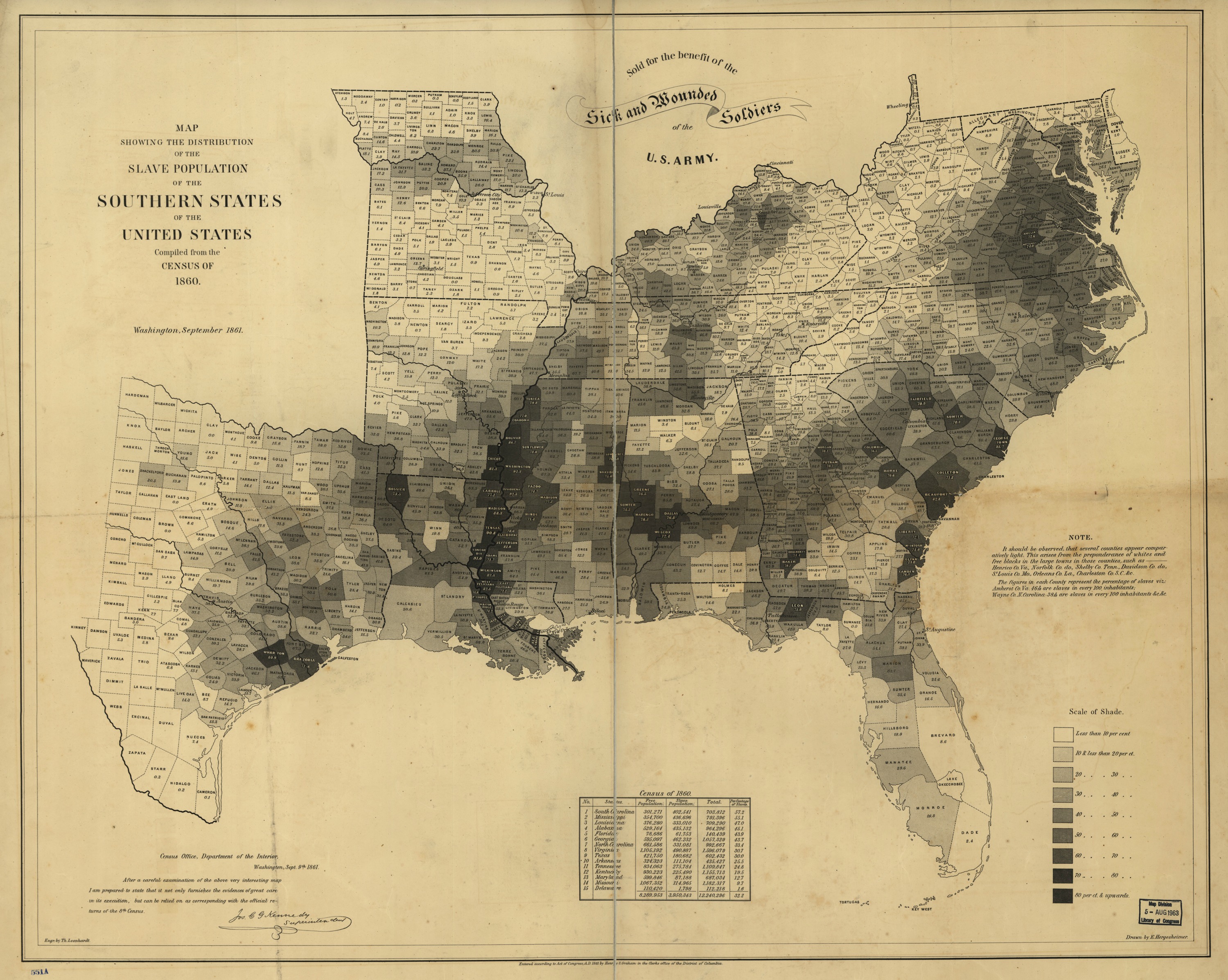
U.S. Coast Survey, Map showing the distribution of the slave population of the southern states of the United States (Washington, DC: Henry S. Graham, 1861). Image from the Library of Congress.
The map on the left is an interactive maps which shows the population density of slavery in the antebellum United States. The map on the right, from 1861, shows the same data from the U.S. Census. The one on the left is a tool of scholarship; the one on the right was a tool of statecraft, war, and emancipation.1 When creating data maps, it is important to keep in mind not just their contemporary relevance but also their historical antecedents. In particular, scholars have often critiqued “the archive” as an artifact of the nation-state and of particular forms of power. Maps that display data as often as not display data which was gathered by some government agency, whether contemporary or historical. In the process of creating a data map with students, you might consider having a discussion about the sources of the data and why it was gathered.
A first data map
For our first data map, we will use a data set from Matthew Lincoln’s research on Dutch art. His dataset on works of art that depict places in Amsterdam can be downloaded from the resources page. You should begin by looking at the repository in which his data is stored, and by reading the associated blog post where he talks about his research questions.2
Examining the data
Begin by answering these questions:
- Where did Lincoln get his data?
- How did he gather it?
- What research questions did Lincoln have?
- How did these questions shape the data?
Now download and open the data sets. Notice that there are three files in comma-separated values (CSV) format. These can be opened in a spreadsheet program like Libre Office or Excel. Try to answer these questions.
- What information do these files hold?
- Where is the spatial data? What kind of spatial data is there?
- What is the relationship between the files?
Uploading the data to CartoDB
We will upload this data to CartoDB. CartoDB is an online mapping tool that has many of the features of more traditional GIS software. (See the discussion on the spatial humanist’s toolbox.) We will use the service’s free tier of service. You will need to create an account on the CartoDB website.
This tutorial is not intended to introduce you to every feature of CartoDB. Instead, you should look at CartoDB’s excellent tutorials, their Map Academy, and their documentation to see all of its features. Instead, we will here focus on asking and answering a humanist’s question with CartoDB.
After you have logged into CartoDB, you will have to navigate to the datasets page to upload your data. Here you will upload the period_place_stats.csv file. (Notice that CartoDB has many datasets already available, and that the datasets you upload are public by default.)

Data page at CartoDB.
Click “create new dataset,” then upload period_place_stats.csv. The resulting page will look like this.

A dataset at CartoDB.
Notice that this tabular data looks the same as the data we uploaded. But there are two important differences. First, the data has been assigned a type. Each of the columns is considered either a number, a string (i.e., a set of characters), a boolean (i.e., true or false), or a date. For instance the column count is correctly considered a number, the column place is correctly considered a string, but the column min_start is considered a number rather than a date since it contains only a year and not a full date identifier. CartoDB will not always correctly interpret your data, so it will sometimes be necessary to cast it to a different type. The second important thing to notice is that a new column called the_geom contains geographic point locations. These have been created from the latitude and longitude columns.
Mapping the data
Clicking the “map view” will show a simple map of all the points in the dataset, one point for each row in the dataset.

Point data at CartoDB.
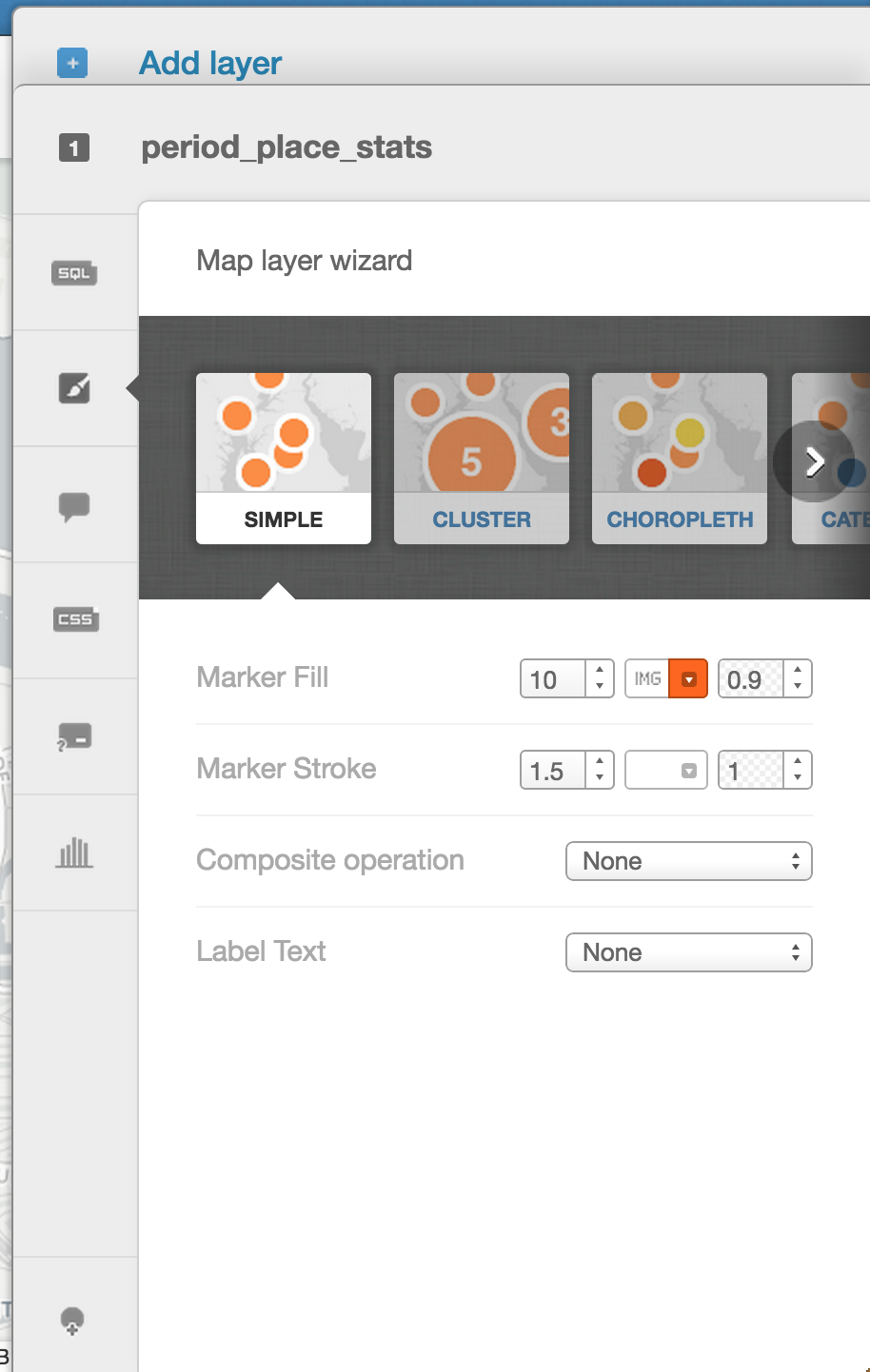
The CartoDB controls for mapping variables int the data to aesthetics on the map.
At this point, CartoDB provides a powerful set of features for mapping features in the data to the display of the map. Try using these tools:
- The “map layer wizard” controls how the points are displayed. Can you map the
countvariable to the size of the markers? To the color of the markers? Can you cluster the markers together, or display them in a heat map? Can you attach labels to the points? - The “infowindow” controls what happens when you interact with the points. Can you display information when points are clicked?
- The “legends” control determines how the points on the map are explained. Can you create a legend which accurately explains what your map is displaying?
- The “filters” tab lets you select which points are displayed based on variables in the data. Can you filter the points so only a given range of years appears?
- The “basemap” button (at the top left) controls the base layer of the map. Can you change it to something more suitable?
Clicking “Visualize” (in the top right) will let you save a map to share it. In addition, it will let you add titles, text, and annotations to the map.
Asking and answering questions
What questions about art or art history can you ask with this data? What answers does this map provide? What features of this map, or what variables in the data, did you use to ask and answer these questions?
Can you use this data to tell a lie? Or, to put it less bluntly, what features of this map are potentially misleading?
Next steps
There are several other datasets listed on the resources page, and there are also many datasets already available through CartoDB. Can you create a different map using one of these datasets? What kind of mapping aesthetics (e.g., size, color, shape) are appropriate for different data sets?
Lincoln’s dataset in the file period_place_stats.csv was created by joining the data in object_data.csv to the points data contained in location_coordinates.csv. Read the section on joining data on page about QGIS. Can you upload the two original files and join those two datasets together following CartoDB’s tutorial for joining data?
See Susan Schulten, Mapping the Nation: History and Cartography in Nineteenth-Century America (Chicago: University of Chicago Press, 2012), especially chapter 4 on slavery and statistical cartography, as well as the book’s companion website.↩
Matthew Lincoln. ‘Middlebury_amsterdam: Data for 2014 Kress Digital Mapping and Art History Summer Institute.’ Zenodo, 2015. doi: 10.5281/zenodo.15461.↩