[A revised version of this post was published at Smithsonian.com.]
In September of 1861, the U.S. Coast Survey published a large map, just under three feet square, titled a “Map showing the distribution of the slave population of the southern states of the United States.” Based on the population statistics gathered in the 1860 census, and certified by the superintendent of the Census Office, the map depicted the percentage of the population enslaved in each county.

U.S. Coast Survey, Map showing the distribution of the slave population of the southern states of the United States (Washington, DC: Henry S. Graham, 1861). Image from the Library of Congress.
The map showed at a glance the large-scale patterns of slavery in the American South: the concentrations of slavery in eastern Virginia, in South Carolina, and most of all along the Mississippi. It also repaid closer examination, since each county was labeled with the exact percentage enslaved. The map of slavery was one of many thematic maps produced in the nineteenth century United States. As Susan Schulten has shown, this particular map was used by the federal government during the Civil War, and it was a favorite of Abraham Lincoln’s.1
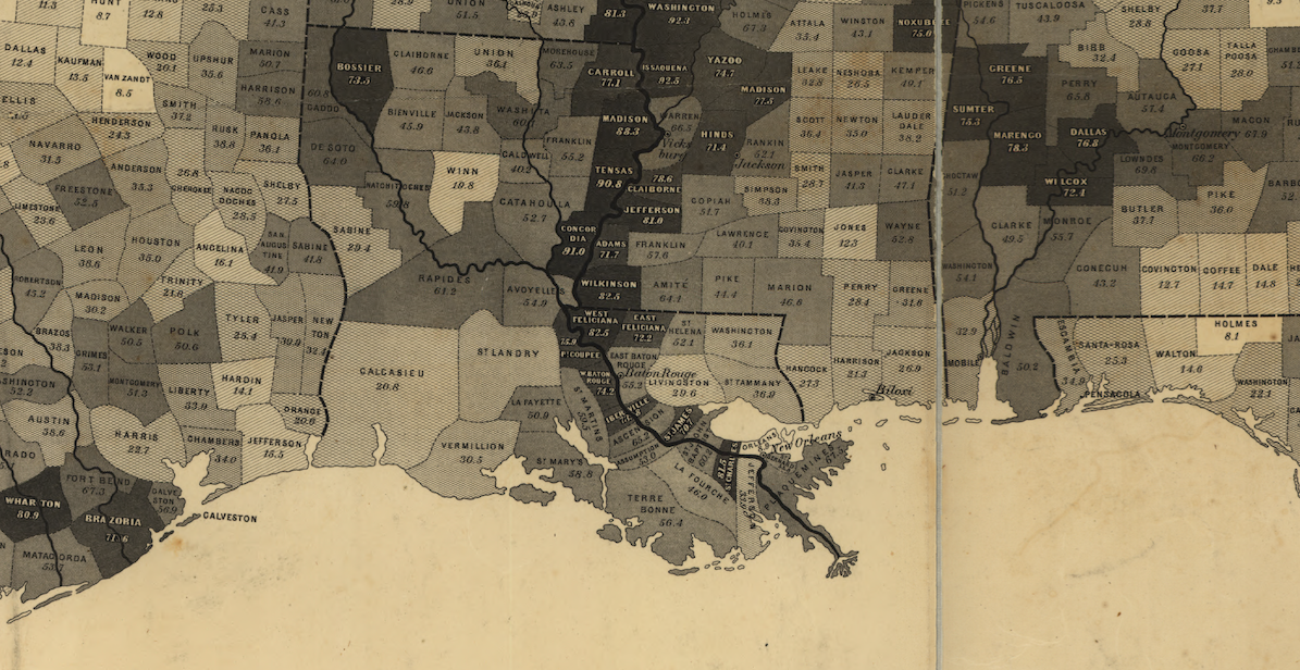
A detail from the U.S. Coast Survey map of slavery, showing the Mississippi River and delta.
Though such thematic maps, in particular of slavery, have their origins in the nineteenth century, the technique is useful for historians. As I see it, one of the main problems for the historians’ method today is the problem of scale. How can we understand the past at different chronological and geographical scales? How can we move intelligibly between looking at individuals and looking at the Atlantic World, between studying a moment and studying several centuries?2 Maps can help, especially interactive web maps that make it possible to zoom in and out, to represent more than one subject of interest, and to set representations of the past in motion in order to show change over time.
I have created an interactive map of the spread of slavery in the United States from 1790 to 1860.3 Using Census data available from the NHGIS, the visualization shows the population of slaves, of free African Americans, of all free people, and of the entire United States. It also shows those subjects as population densities and percentages of the population.4 For any given variable, the scales are held constant from year to year so that the user can see change over time. You can use the map for yourself, and I’ve also written briefly about what the map shows below.5 Historians have of course often made use of maps of slavery, in particular maps based on the Census, in support of their arguments. What I’ve tried to do in this interactive map is make it possible for users (including me) to explore the census data in support of making historical arguments.6

Screen shot of the interactive map of U.S. slavery.
The first thing to observe is that slavery spread more than it grew. The population of slaves in 1790 or 1800 was already very high compared the maximum population levels.7 In fact, in Charleston County, South Carolina (one of the counties with the highest populations of slaves) the number of enslaved people in 1860 was only 63% of what it had been in 1840. This is not to say that the total number of slaves in the eastern seaboard states did not go up over time. But the number of enslaved people in a particular place did not grow at anything like the rate of free people in the north. The free population in the north both grew in the same place and spread to the west. The slave population had a different dynamic. It grew in intensity in places around the Chesapeake bay, even as slavery was gradually abolished in the North. But primarily the slave population spread to the fertile crescent of lands in Georgia, Alabama, and Mississippi, and most of all to the Mississippi River valley. Below you can see two animations of the density of the slave population and the density of the total population (keep in mind that the scales are different). What you see in these maps is the spread of slavery through the domestic slave trade.8 You also see the origins of the sectional crisis in the continual expansion of slavery.
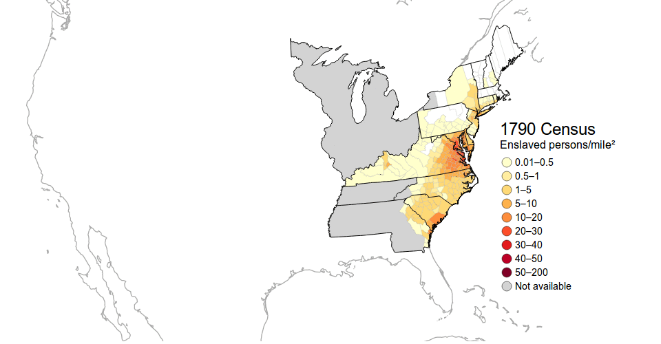
An animation of the density of slave population from 1790 to 1860. Notice that slavery spreads more than it grows.

An animation of density of the total population from 1790 to 1860. Notice that population in the north both grows in place and spreads westward.
Another observation to make about slavery in the United States is what an extraordinarily high percentage of the population was enslaved. The majority slave populations of the Chesapeake, the South Carolina and Georgia coast were soon duplicated in the majority slave populations of the Mississippi River valley.

An animation of the percentage of the population enslaved from 1790 to 1860.
A striking way to see the importance of slavery is to look at a map of the total free population: a photo negative, if you will, of slavery. When looking at the density of the population that was free, large swathes of the South appear virtually depopulated. (Perhaps this is what a history book looks like that fails to take includes slaves?)

The population density of all free persons in 1860.
Finally, the dynamics of the free African American population looked more like the free white population than the slave population. The Free African American population seems to have primarily settled along the Eastern seaboard and especially in the cities of the northern United States. Free African Americans were almost entirely excluded from most of the deep South, except the cities.
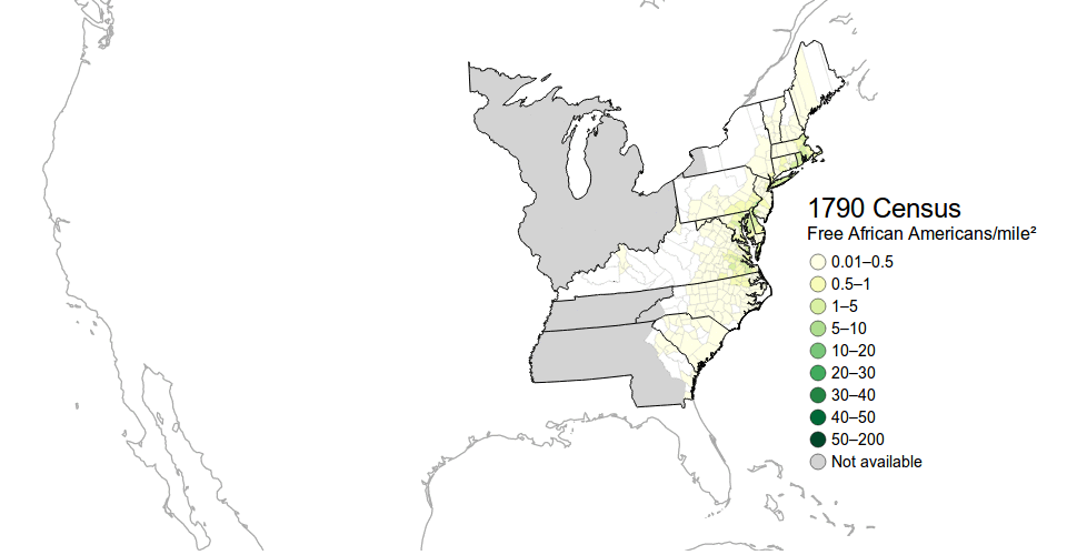
The population densite of free African Americans.
Historians have long used maps of slavery to advance their arguments.9 I hope this map finds some use in making more arguments about the history of slavery, and especially for helping students to grasp the big picture of the “peculiar institution” which made the nation “half slave and half free.”10
See Susan Schulten, Mapping the Nation: History and Cartography in Nineteenth-Century America (Chicago: University of Chicago Press, 2012), especially chapter 4 on slavery and statistical cartography. Also see the book’s companion website, which includes many images of maps of slavery. ↩︎
For one discussion of the problem of scale, see David Armitage and Jo Guldi, “Le Retour de la longue durée: Une perspective anglo-saxonne,” Annales, in press. Whatever the reason for the blockbuster success of Thomas Picketty’s Capital in the Twenty-First Century, it's worth noting that the book is primarily a longue durée history of the structure of capital. ↩︎
I am grateful for suggestions from Yoni Appelbaum, John Hannigan, and Caleb McDaniel, who each looked at the map in development, though they will each find more things they wished were different. ↩︎
You might think of the visualization as 88 maps = 8 decades ✕ 11 variables. ↩︎
The map represents a lot of data, and I have not been able to make it snappy enough for my satisfaction, particularly for mobile devices. Hence the animated GIFs below. ↩︎
Of course there is far more to the history of slavery than just the Census data, which alone cannot answer any of the interpretative questions that historians have asked. ↩︎
This is remarkable given that in the Revolution many slaves escaped to or with the British army. ↩︎
Steven Deyle writes, “I believe it is safe to conclude that between 1820 and 1860 at least 875,000 American slaves were forcibly removed from the Upper South to the Lower South, and that between 60 and 70 percent of these individuals were transported via the interregional slave trade.” Steven Deyle, Carry Me Back: The Domestic Slave Trade in American Life (Oxford University Press, 2005), 289. ↩︎
Perhaps I will provide a few examples in a future post. ↩︎
From Abraham Lincoln’s “House Divided” speech: “Either the opponents of slavery, will arrest the further spread of it, and place it where the public mind shall rest in the belief that it is in the course of ultimate extinction; or its advocates will push it forward, till it shall become alike lawful in all the States, old as well as new—North as well as South.” ↩︎