A common response to digital history research is that has failed to make an argumentative or interpretative payoff commensurate with the amount of effort that has been put into it. Broadly speaking, I’m sympathetic to that claim. But there is a particular form that this claim sometimes takes which I think is mistaken: the idea that even when interpretations or arguments from digital history work are presented, they do not tell us anything new. Scott Weingart has written perceptively and more generally about the problem that “digital history can never be new.” I want to add only a small piece to that discussion.
When I present the results of my work as a visualization, audiences sometimes react by saying that they can immediately explain what the visualization shows and that it merely reflects what they already knew. Matthew Lincoln has written about the “confabulation” or “just-so stories” that readers of visualizations can come up with in order to explain them. And it’s not just the audiences for visualizations who do this; I do it myself whenever I create visualizations for my own consumption. The sense that a visualization is immediately explainable is the result, I think, of the ability of visualizations to rapidly and persuasively communicate large amounts of information.
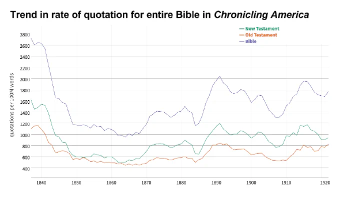
The problem is that often it is not possible to know what a visualization would look like in advance, and so it should not be possible immediately after seeing it to explain it as something that we already know. To convey this point, I’ve been trying a new technique when giving talks. Before showing the audience a visualization, I first show them a blank visualization with just the axes and title, and ask them to sketch out what they think the trend will be. For instance, here is a blank visualization of the trends in the rate at which the Bible was quoted in nineteenth-century U.S. newspapers, from my America’s Public Bible project.

What would you predict the trends should be for the rates at which the Bible was quoted in nineteenth-century U.S. newspapers?
Before I made the visualization, I couldn’t predict the trend. I would have said something like “vaguely downwards.” I certainly could not have predicted the scale. When I have given this talk to various audiences, no one has been able to predict what the actual visualization should look like. Nor for that matter could anyone guess what the top ten most frequently quoted Bible verses were with any degree of accuracy—certainly not me.

The actual trend lines are not easily guessed.
I’ve found that this simple approach, used both for myself and with audiences, helps dispel the sense that what is learned from visualizations was already obvious.
Updates, 10 January 2018
- An additional thought that occurs to me after discussion with my collaborator, Kellen Funk. In many instances, scholars might already know that a phenomenon happened, but that is different than the details of how it happened. For instance, before Ryan Cordell et al. did the work of the Viral Texts project, scholars knew that newspapers reprinted one another, but that project showed the actual relationships created by those borrowings. Similarly, scholars have long known that states borrowed their codes of civil procedure from New York, but Kellen and I have created a network of those borrowings. Knowing that there is a network and knowing what the network is are two different kinds of knowledge.
- Hadley Wickham pointed out that it is possible to create a p-value by showing an audience different plots and letting them try to identify the actual plot. He has an article on the subject. H. Wickham, D. Cook, H. Hofmann and A. Buja, “Graphical inference for infovis,” in IEEE Transactions on Visualization and Computer Graphics, vol. 16, no. 6, pp. 973-979, Nov.-Dec. 2010. doi: 10.1109/TVCG.2010.161